Function Assessment and Improvement
The
-
Graphical analysis of the measured data and the function nodes
See Graphical Analysis of Data and Function Nodes for details.
-
Residual analysis
See Residual Analysis for details.
Graphical Analysis of Data and Function Nodes
The scatter plots (Analysis Menu) in the following windows provide a graphical control of the measurement data and the function evaluation:
-
"Data - Training Data/Test Data/Training and Test Data"
-
"FunctionNode - Training Data/Test Data/Training and Test Data"
-
"Data and Nodes - Training Data/Test Data/Training and Test Data"
When analyzing the measurement data, the following points should be considered particularly:
-
Have all data been varied in accordance to the Design of Experiment (DoE) and has the measured system remained in the intended operating mode?
-
Are the output values in a physically reasonable range?
-
Are there outliers included which must be removed if appropriate?
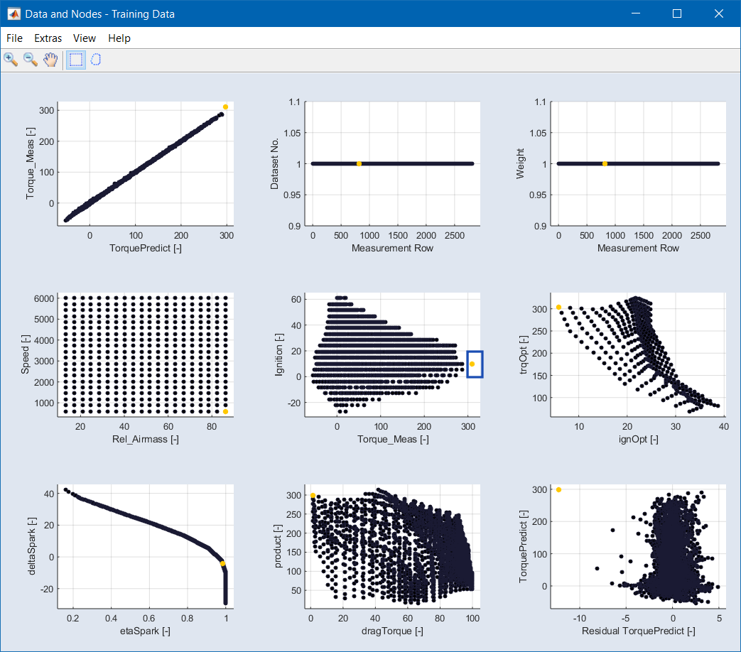
Fig. 2: The "Data and Nodes" window
Residual Analysis
Residuals are the deviation of the data calculated according to the optimization criteria to the measured data.
Three types of residual analysis are available:
-
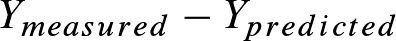
For the Absolute Error Analysis, all residuals are displayed:
-
When performing a Studentized error analysis, the quotient from the residual and the RMSE RMSE (Root Mean Squared Error) is displayed:
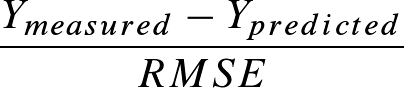
Thus, the error based on the RMSE is shown.
Residual analysis is performed via the Analysis > Residual Analysis > * menu options. These menu options open four plot windows:
"Histogram" Window
The "Histogram" window displays the current error distribution (blue bars) on the total number of values for the predicted function output. The normal distribution fit (red line) is drawn additionally. This function enables you to validate whether the current error distribution fits to the normal distribution or not.
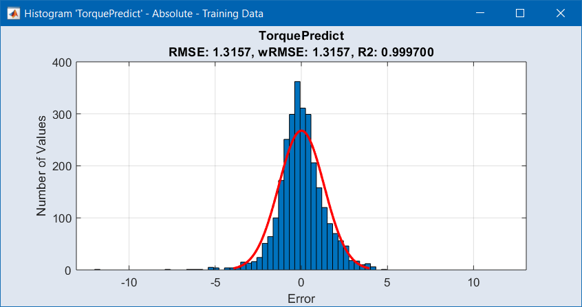
Fig. 3: The "Histogram" window
"Residuals over Inputs" Window
This window shows several scatter plots: data set number, Active flag and weight against measurement number, as well as the errors (absolute, relative, or studentized) of the computed data against the measured data. For a detailed description, see Improving the Model Quality.
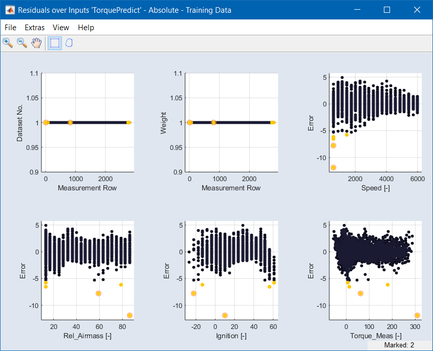
Fig. 4: The "Residuals over Inputs" window
"Residuals over Outputs" Window
This window shows scatter plots of the errors (absolute, relative, or studentized) of the computed data against the function nodes.
"Measured vs. Predicted" Window
In this window, the model output is displayed on the X axis and the measuring points are displayed on the Y axis. A perfect match between the two would result in a "pearl necklace" (y = x). The further the points are removed from the y = x line, the greater the difference between measurement and model output.
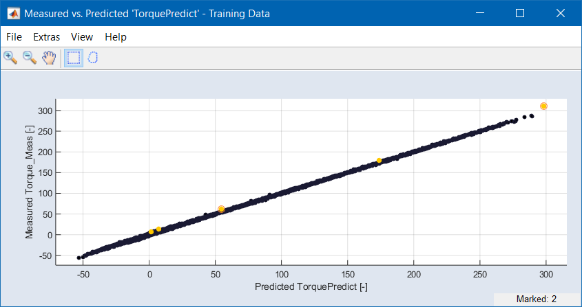
Fig. 5: The "Measured vs. Predicted" window
See also Scatter Plot for a detailed description of scatter plot windows.
Improving the Model Quality
Outliers can be caused by measurement errors or by insufficient function quality. The scatter plots mentioned in sections Graphical Analysis of Data and Function Nodes and Residual Analysis allow visually determining and improving the model quality. You can search for outliers, draw a rectangle to mark them, delete them, deactivate them or reduce their weight manually, or you can set an outlier threshold and detect outliers automatically.
See also