Element Configuration
Visualization step >  > Configure Single Element
The Element Configuration window contains the following elements:
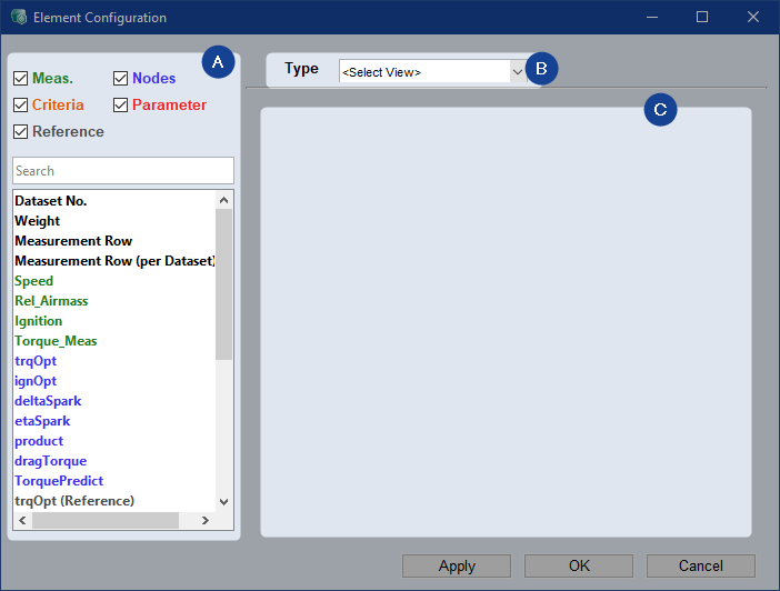
 Signals
Checkboxes to filter for signal types. For node and criteria signals, reference data set evaluation is also available.
Searchbar to search for specific signals.
List to drag and drop specific signals into respective fields.
 View Type
Drop-down list to select the type of view of the element.
 Configuration
Area where you can configure the element depending on the selected type of view.
|
Note |
|---|
|
If you configure an existing element and change the View Type the previous configurations are lost. |
 Bit Plot
To represent logical signal states, use the Bit Plot.
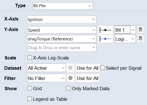
All except parameters are available signals.
X-Axis
You can select a signal from the drop-down, type it, or drag and drop it from the list to set it as x-axis.
Y-Axis
You can select a signal from the drop-down, type it, or drag and drop it from the list to set it as y-axis.
Use  to remove the signal from the plot.
Plot Properties 
Click the dynamic plot properties button to set the appearance of the signal in the plot. An appropriate line style is automatically selected when you set a signal, e.g. a solid line is selected if the x-axis is time.
You can set the appearance of the markers and plot line, and whether to display the signal on the right axis. To hide the signal in the plot, deactivate the Visible checkbox and the dynamic plot properties button will be grayed out.
Select a single bit of the signal to display in the plot, or select Logical where for the entire signal, 0 is false and the rest is true.
Scale
Activate the *-Axis Log-Scale checkbox to use a logarithmic scale on the axis.
Dataset
Select whether to use All Active, the Active Training, or the Active Test dataset for the element view. To select specific datasets (only active datasets are available), use the Custom option from the drop-down list or the  button. The Use for All button applies the configurations to all elements on the tab. The active datasets can be changed using the Data > Active Datasets menu or the Active Datasets hyperlink in the Visualization step.
To specify the dataset per signal, activate the Select per Signal checkbox. A button appears next to each signal. It opens the Select Datasets window, where you can select to use All Active, the Active Training, or the Active Test, or a Custom combination of datasets for the signal. This e.g., allows to show a signal from different datasets above each other.
Filter
Select the filter you want to use for the element from the drop-down list. To create a new filter, use the button. For more information, see Filtering Data. The Use for All button applies the filter to all elements on the tab.
Show
Grid: Activate to display a plot background grid.
Only Marked Data: Activate to display only the points within a selection.
Legend as Table: Many signals in a plot can make the legend very large, so it can also be displayed outside the plot as a table. In this legend table, plot properties can be directly set by clicking the dynamic button . Selecting a signal in the table (as in the legend) highlights it in the plot. Additionally, each cursor is represented by its own column in the table.
Data Contour Plot
To visualize lines of equal data values, use the Data Contour Plot.
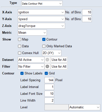
X-Axis
You can select a signal from the drop-down, type it, or drag and drop it from the list to set it as x-axis.
Y-Axis
You can select a signal from the drop-down, type it, or drag and drop it from the list to set it as y-axis.
No. of Bins
Define a number of grid points for the X- and Y-axis.
Z-Axis
You can select a signal from the drop-down, type it, or drag and drop it from the list to set it as z-axis.
Metric
The metric is calculated on the points in a bin of the given Z-axis signal. The bins function like a histogram. Internally, overlapping bins are used to smooth the calculated values.
Mean/Min/Max/Median: Calculates the mean/min/max/median of the points in a bin.
Data Density: Calculates the percentage of points in a bin compared to all points.
Show
Activate the check-box to display the corresponding elements.
Map: Map of the data.
Contour: Contour lines of the data.
Data: Data points.
Only Marked Data: Map, contour, and data points of selected data only.
Convex Hull: Smallest 2D or 3D convex set containing the data.
Dataset
Select whether to use All Active, the Active Training, or the Active Test dataset for the element view. To select specific datasets (only active datasets are available), use the Custom option from the drop-down list or the button. The Use for All button applies the configurations to all elements on the tab. The active datasets can be changed using the Data > Active Datasets menu or the Active Datasets hyperlink in the Visualization step.
Filter
Select the filter you want to use for the element from the drop-down list. To create a new filter, use the button. For more information, see Filtering Data. The Use for All button applies the filter to all elements on the tab.
Contour
To display the grid in the plot, activate the Grid check-box.
To show labels on the contour lines, activate the Show Labels check-box.
Use the input fields to customize the contour lines and labels. You can specify the label spacing, interval, and font size, as well as the contour line width.
Level:
-
Automatic: Values that span the value range are selected.
-
Number of Levels: Contour lines are drawn at n automatically selected heights. Valid entries are integers between 1 and 100.
-
Manual: Specify the contour levels as a vector of monotonically increasing values (e.g., [10, 40, 70, 80]).
Data Table
To structure and display your data in tabular form, use the Data Table.
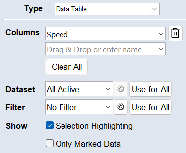
All except parameters are available signals.
Columns
You can select a signal from the drop-down, type it, or drag and drop it from the list to set it as column.
Comments:
Use to delete the column from the table.
 Clear All deletes all set columns.
Dataset
Select whether to use All Active, the Active Training, or the Active Test dataset for the element view. To select specific datasets (only active datasets are available), use the Custom option from the drop-down list or the button. The Use for All button applies the configurations to all elements on the tab. The active datasets can be changed using the Data > Active Datasets menu or the Active Datasets hyperlink in the Visualization step.
Filter
Select the filter you want to use for the element from the drop-down list. To create a new filter, use the button. For more information, see Filtering Data. The Use for All button applies the filter to all elements on the tab.
Show
Selection Highlighting: Highlights the data points within a selection in the table. A highlighting column is added to the table.
Only Marked Data: Activate to display only the points within a selection.
Histogram
To visualize signal data as a histogram, use the Histogram plot.
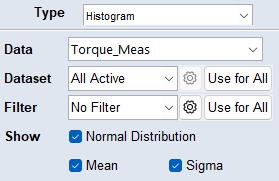
Data
You can select a signal from the drop-down, type it, or drag and drop it from the list to set it as data label.
Dataset
Select whether to use All Active, the Active Training, or the Active Test dataset for the element view. To select specific datasets (only active datasets are available), use the Custom option from the drop-down list or the button. The Use for All button applies the configurations to all elements on the tab. The active datasets can be changed using the Data > Active Datasets menu or the Active Datasets hyperlink in the Visualization step.
Filter
Select the filter you want to use for the element from the drop-down list. To create a new filter, use the button. For more information, see Filtering Data. The Use for All button applies the filter to all elements on the tab.
Show
Normal Distribution: Displays a fitted normal distribution (red curve) overlaid on the histogram. The curve's parameters (mean and standard deviation) are calculated to best represent the given dataset.
Mean (μ): Shows the mean (average) value of the dataset as a vertical black dashed line in the histogram. It represents the central tendency of the data.
Sigma (σ): Shows the standard deviation as vertical gray dashed lines on either side of the mean. Sigma measures the dispersion or spread of data points around the mean.
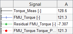
To display residuals as a histogram, use the Residual Histogram plot. Residuals are the deviations or errors between two signals. This plot type can also display RMSE and R².
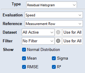
Evaluation
You can select a signal from the drop-down, type it, or drag and drop it from the list to set it as evaluation.
Reference
You can select a signal from the drop-down, type it, or drag and drop it from the list to set it as reference. The residuals are calculated as Reference minus Evaluation.
Dataset
Select whether to use All Active, the Active Training, or the Active Test dataset for the element view. To select specific datasets (only active datasets are available), use the Custom option from the drop-down list or the button. The Use for All button applies the configurations to all elements on the tab. The active datasets can be changed using the Data > Active Datasets menu or the Active Datasets hyperlink in the Visualization step.
Filter
Select the filter you want to use for the element from the drop-down list. To create a new filter, use the button. For more information, see Filtering Data. The Use for All button applies the filter to all elements on the tab.
Show
Normal Distribution: Displays a fitted normal distribution (red curve) overlaid on the histogram. The curve's parameters (mean and standard deviation) are calculated to best represent the given dataset.
Mean (μ): Shows the mean (average) value of the dataset as a vertical black dashed line in the histogram. It represents the central tendency of the data.
Sigma (σ): Shows the standard deviation as vertical gray dashed lines on either side of the mean. Sigma measures the dispersion or spread of data points around the mean.
RMSE (Root Mean Square Error): Shows the average difference between the values predicted by the model and the actual values.
R² (Coefficient of Determination): Shows the goodness of fit as a value between 0 and 1. An R² value close to 1 signifies an excellent fit, while values near 0 indicate a poor fit. Negative values can occur, indicating a really bad model.
For more information on RSME and R², see Variables RMSE and R2.
Measured vs. Predicted
To compare measured and predicted signals, use Measured vs Predicted.
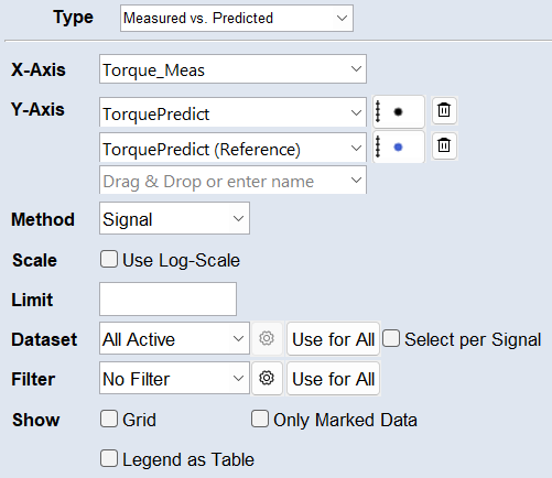
All except parameters are available signals.
X-Axis
You can select a signal from the drop-down, type it, or drag and drop it from the list to set it as x-axis.
Y-Axis
You can select a signal from the drop-down, type it, or drag and drop it from the list to set it as y-axis.
Use to remove the signal from the plot.
Plot Properties
Click the dynamic plot properties button to set the appearance of the signal in the plot. An appropriate line style is automatically selected when you set a signal, e.g. a solid line is selected if the x-axis is time.
You can set the appearance of the markers and plot line, and whether to display the signal on the right axis. To hide the signal in the plot, deactivate the Visible checkbox and the dynamic plot properties button will be grayed out.
Method
Select whether to compare a signal or an error metric of it to another signal.
Available error metrics are:
Absolute Error: The difference between the actual value and the predicted value, regardless of the direction of the error.
Relative Error: A ratio that compares the absolute error to the actual value. It gives a sense of the error relative to the size of the actual value.
Studentized Error: Assess the significance of the difference between an observed value and an expected value. It takes into account the variability in the data.
Scale
Activate the Use Log-Scale checkbox to use a logarithmic scale on all axes.
Limit
Set a value as +/- error limit.
The limit is indicated by two lines in the plot. You can see the number/percentage of points outside the limits in the legend.
Dataset
Select whether to use All Active, the Active Training, or the Active Test dataset for the element view. To select specific datasets (only active datasets are available), use the Custom option from the drop-down list or the button. The Use for All button applies the configurations to all elements on the tab. The active datasets can be changed using the Data > Active Datasets menu or the Active Datasets hyperlink in the Visualization step.
To specify the dataset per signal, activate the Select per Signal checkbox. A button appears next to each signal. It opens the Select Datasets window, where you can select to use All Active, the Active Training, or the Active Test, or a Custom combination of datasets for the signal. This e.g., allows to show a signal from different datasets above each other.
Filter
Select the filter you want to use for the element from the drop-down list. To create a new filter, use the button. For more information, see Filtering Data. The Use for All button applies the filter to all elements on the tab.
Show
Grid: Activate to display a plot background grid.
Only Marked Data: Activate to display only the points within a selection.
Legend as Table: Many signals in a plot can make the legend very large, so it can also be displayed outside the plot as a table. In this legend table, plot properties can be directly set by clicking the dynamic button . Selecting a signal in the table (as in the legend) highlights it in the plot. Additionally, each cursor is represented by its own column in the table.
Parameter Contour Plot
To visualize lines of equal parameter values, use the Parameter Contour Plot.
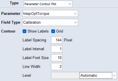
Only parameters can be selected here.
Parameter
You can select a signal from the drop-down, type it, or drag and drop it from the list to set it as parameter.
Field Type
Select which data to use as the field type.
Contour
To display the grid in the plot, activate the Grid check-box.
To show labels on the contour lines, activate the Show Labels check-box.
Use the input fields to customize the contour lines and labels. You can specify the label spacing, interval, and font size, as well as the contour line width.
Level:
-
Automatic: Values that span the value range are selected.
-
Number of Levels: Contour lines are drawn at n automatically selected heights. Valid entries are integers between 1 and 100.
-
Manual: Specify the contour levels as a vector of monotonically increasing values (e.g., [10, 40, 70, 80]).
Parameter Heatmap
To show how your parameter data is distributed, use the Parameter Heatmap.
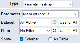
Only parameters can be selected here.
Parameter
You can select a signal from the drop-down, type it, or drag and drop it from the list to set it as parameter.
Dataset
Select whether to use All Active, the Active Training, or the Active Test dataset for the element view. To select specific datasets (only active datasets are available), use the Custom option from the drop-down list or the button. The Use for All button applies the configurations to all elements on the tab. The active datasets can be changed using the Data > Active Datasets menu or the Active Datasets hyperlink in the Visualization step.
Filter
Select the filter you want to use for the element from the drop-down list. To create a new filter, use the button. For more information, see Filtering Data. The Use for All button applies the filter to all elements on the tab.
Show Colorbar/as Table
Activate the corresponding checkbox to display the heatmap whether as a colorbar or as a table.
Parameter Plot
To visualize a parameter such as a map or curve, use the Parameter Plot.
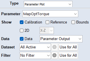
Only parameters can be selected here.
Parameter
You can select a signal from the drop-down, type it, or drag and drop it from the list to set it as parameter.
Activate the corresponding checkbox to show:
- the parameter from the working parameterset (Calibration)
-
the reference/initial parameterset (Reference, see also Dealing with Reference Parameters)
-
When activated, the Parameter value table shows the differences between the reference and working parameter.
-
-
the upper and lower bounds (Bounds, only available for curve and map parameters)
-
the data points as black dots in the plot. Select the data to display from the drop-down list (Data).
The signals of the project and a special signal Parameter Output are available. Parameter Output shows the input signals evaluated by the parameter. This is useful to see the distribution of the input signals.
|
Note |
|---|
|
To display selected data points in parameter plots, activate the Data checkbox. |
2D View
Activate the checkbox to display the parameter plot as a 2D plot. Use the drop-down menu to select whether to display the X-Z or the Y-Z axes as the X and Y axes of the 2D plot.
The possible cuts in the X-Z or Y-Z plane are displayed as a table. Select a row in the table to display the data as connected points in the 2D plot. Select multiple cuts in the table (Ctrl or Shift) to display multiple values in the plot.
Dataset
Select whether to use All Active, the Active Training, or the Active Test dataset for the element view. To select specific datasets (only active datasets are available), use the Custom option from the drop-down list or the button. The Use for All button applies the configurations to all elements on the tab. The active datasets can be changed using the Data > Active Datasets menu or the Active Datasets hyperlink in the Visualization step.
Filter
Select the filter you want to use for the element from the drop-down list. To create a new filter, use the button. For more information, see Filtering Data. The Use for All button applies the filter to all elements on the tab.
Parameter Table
To display parameter values in a structured table, use the Parameter Table.
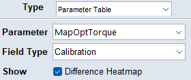
Only parameters can be selected here.
Parameter
You can select a signal from the drop-down, type it, or drag and drop it from the list to set it as parameter.
Field Type
Select which data to use as the field type.
Show
To show the difference to the reference as a heatmap in the table, activate the check-box.
Signal Plot
To show data as scatter or scope plots, use the Signal Plot.
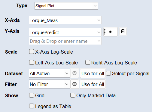
All except parameters are available signals.
X-Axis
You can select a signal from the drop-down, type it, or drag and drop it from the list to set it as x-axis.
Y-Axis
You can select a signal from the drop-down, type it, or drag and drop it from the list to set it as y-axis.
Use to remove the signal from the plot.
Plot Properties
Click the dynamic plot properties button to set the appearance of the signal in the plot. An appropriate line style is automatically selected when you set a signal, e.g. a solid line is selected if the x-axis is time.
You can set the appearance of the markers and plot line, and whether to display the signal on the right axis. To hide the signal in the plot, deactivate the Visible checkbox and the dynamic plot properties button will be grayed out.
Scale
Activate the *-Axis Log-Scale checkbox to use a logarithmic scale on the axis.
Dataset
Select whether to use All Active, the Active Training, or the Active Test dataset for the element view. To select specific datasets (only active datasets are available), use the Custom option from the drop-down list or the button. The Use for All button applies the configurations to all elements on the tab. The active datasets can be changed using the Data > Active Datasets menu or the Active Datasets hyperlink in the Visualization step.
To specify the dataset per signal, activate the Select per Signal checkbox. A button appears next to each signal. It opens the Select Datasets window, where you can select to use All Active, the Active Training, or the Active Test, or a Custom combination of datasets for the signal. This e.g., allows to show a signal from different datasets above each other.
Filter
Select the filter you want to use for the element from the drop-down list. To create a new filter, use the button. For more information, see Filtering Data. The Use for All button applies the filter to all elements on the tab.
Show
Grid: Activate to display a plot background grid.
Only Marked Data: Activate to display only the points within a selection.
Legend as Table: Many signals in a plot can make the legend very large, so it can also be displayed outside the plot as a table. In this legend table, plot properties can be directly set by clicking the dynamic button . Selecting a signal in the table (as in the legend) highlights it in the plot. Additionally, each cursor is represented by its own column in the table.
Signal Plot 3D
To visualize signals in 3D, use the Signal Plot 3D.
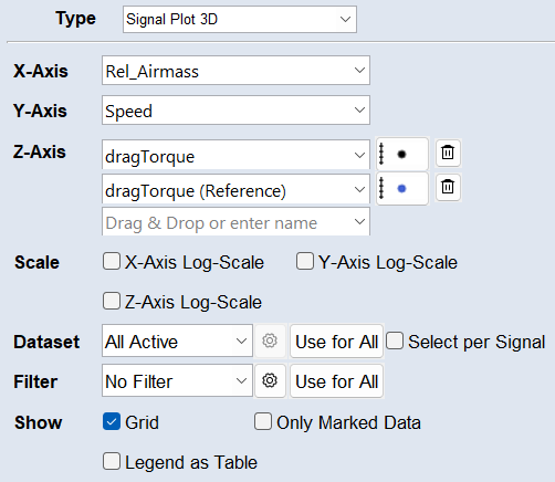
X-Axis
You can select a signal from the drop-down, type it, or drag and drop it from the list to set it as x-axis.
Y-Axis
You can select a signal from the drop-down, type it, or drag and drop it from the list to set it as y-axis.
Z-Axis
You can select a signal from the drop-down, type it, or drag and drop it from the list to set it as z-axis.
Use to remove the signal from the plot.
Plot Properties
Click the dynamic plot properties button to set the appearance of the signal in the plot. An appropriate line style is automatically selected when you set a signal, e.g. a solid line is selected if the x-axis is time.
You can set the appearance of the markers and plot line, and whether to display the signal on the right axis. To hide the signal in the plot, deactivate the Visible checkbox and the dynamic plot properties button will be grayed out.
Scale
Activate the *-Axis Log-Scale checkbox to use a logarithmic scale on the axis.
Dataset
Select whether to use All Active, the Active Training, or the Active Test dataset for the element view. To select specific datasets (only active datasets are available), use the Custom option from the drop-down list or the button. The Use for All button applies the configurations to all elements on the tab. The active datasets can be changed using the Data > Active Datasets menu or the Active Datasets hyperlink in the Visualization step.
To specify the dataset per signal, activate the Select per Signal checkbox. A button appears next to each signal. It opens the Select Datasets window, where you can select to use All Active, the Active Training, or the Active Test, or a Custom combination of datasets for the signal. This e.g., allows to show a signal from different datasets above each other.
Filter
Select the filter you want to use for the element from the drop-down list. To create a new filter, use the button. For more information, see Filtering Data. The Use for All button applies the filter to all elements on the tab.
Show
Grid: Activate to display a plot background grid.
Only Marked Data: Activate to display only the points within a selection.
Legend as Table: Many signals in a plot can make the legend very large, so it can also be displayed outside the plot as a table. In this legend table, plot properties can be directly set by clicking the dynamic button . Selecting a signal in the table (as in the legend) highlights it in the plot. Additionally, each cursor is represented by its own column in the table.
Text
To display a text element, use Text.
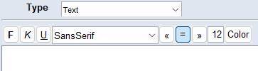
You can make the following style settings:
-
Font type, size, weight and color
-
Italicize, underline and align the text
Changes will always be applied to the whole text.
All signal types are available for drag and drop to copy the name into the text field.
Apply
Applies your settings, but does not close the window.
OK
Applies your settings and closes the window.
Cancel
Discards your settings and closes the window.