Visualization
In addition to the performed steps from Data to Optimization, ASCMO-MOCA provides a Visualization Step for having results visually in one place. You can create data and parameter visualizations according to your own taste. The Visualization step allows to combine different plot types to create user defined representations:
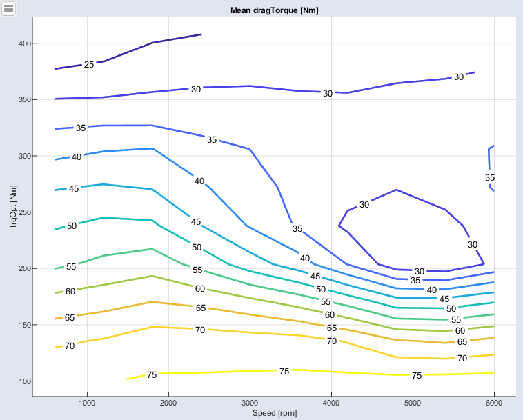
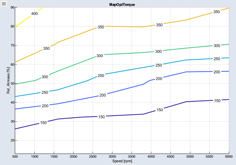
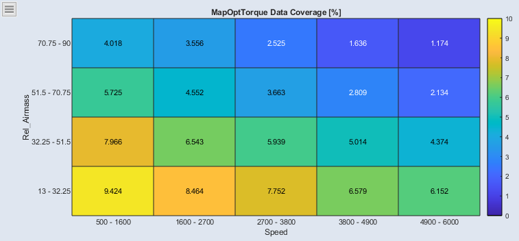
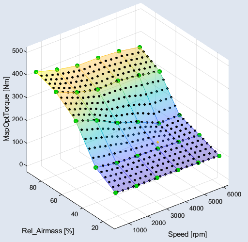
Data points are assigned to overlapping bins/intervals and the metric (mean, min, max) is calculated for data points per interval. The calculated value is then assigned to specific grid values. From the two-dimensional grid values, a map is calculated internally and visualized with contour lines.
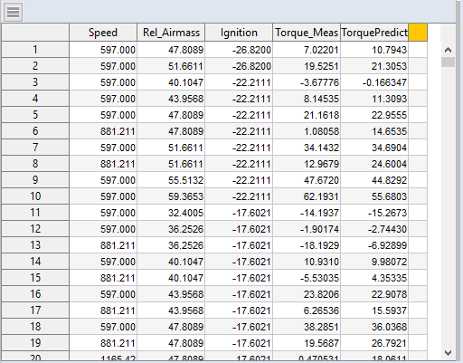
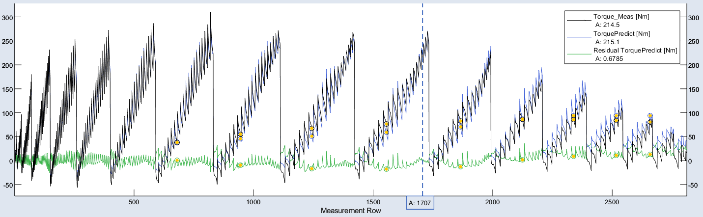
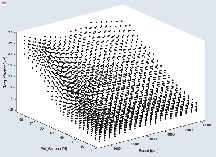
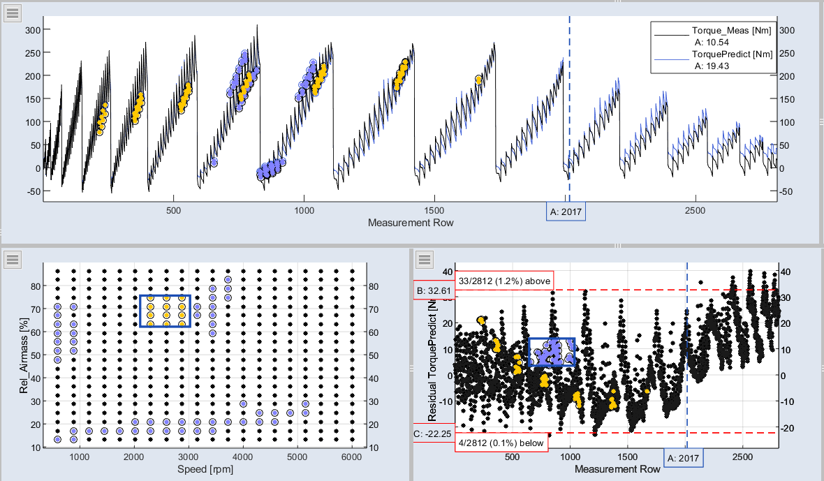
For all types showing imported or calculated data, one or more datasets can be selected to be visualized. Beside this also additional settings can be configured to show only data points, also the lines between the points or a grid in background.
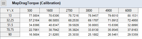
For the types showing parameters, beside the selection of the parameter itself additional content can be chosen such as the reference values or bounds. Parameter plots cannot only show the current calibration, they can also be used to change it. Through this interaction, the Visualization Step acts like an experimental environment. The effect of changed values is directly visualized in all other plots.
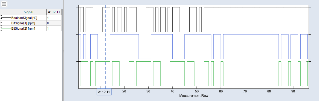
You can define the layout of multiple views. Selections (rectangles and lassoes) can be used in signalplots and highlight the data in any view. Cursors can show the value at a specific time. Cursors can be set as a limit to show the number of values outside the limit. Selections and cursors are saved with the project.
For each visualization tab the screen can be divided into different elements and separately filled. Therefore two modes are available at the bottom: View and Configuration. The View mode also provides the possibility to use a print mode and to export or copy images to the clipboard. Beside visualizing plots you can also insert text into the elements. The visualization tabs can be undocked and arranged on the monitor according to your wishes. Tabs can be easily renamed by double-clicking on it.
The Visualization step supports you in data comparison and to have your data visualized at a glance in one overview.
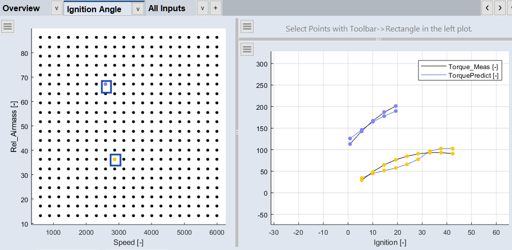
The Only Marked Data option ( > Configure Single Element > Only Marked Data) gives you a better overview, e.g. prediction vs. ignition angle per operating point.
See also