Discrete Histogram
Bar chart that shows the frequency of individual, distinct values in a dataset, rather than grouping them into continuous ranges like a Histogram.
Discrete Bar Histogram
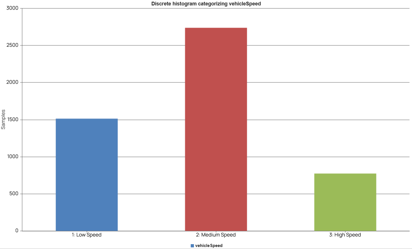
The discrete bar histogram below displays the distribution of vehicle speed data, categorized into three distinct levels: "1: Low Speed," "2: Medium Speed," and "3: High Speed." The y-axis, labeled "Samples," indicates the count for each category.
Discrete Pie Histogram
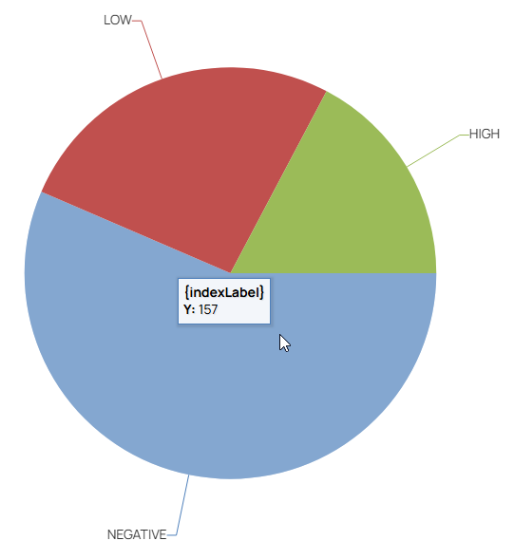
The discrete pie histogram displays the data as pie.
In the report, you can use the following options in the context menu of the chart:
- Toggle Empty Fields: Empty fields are not shown in the diagram.
- Change Discrete: Switch between discrete bar histogram and discrete pie histogram.