Chart Functions
In plots and histograms, you can use chart functions for statistical analysis. The following example shows the normal density function:
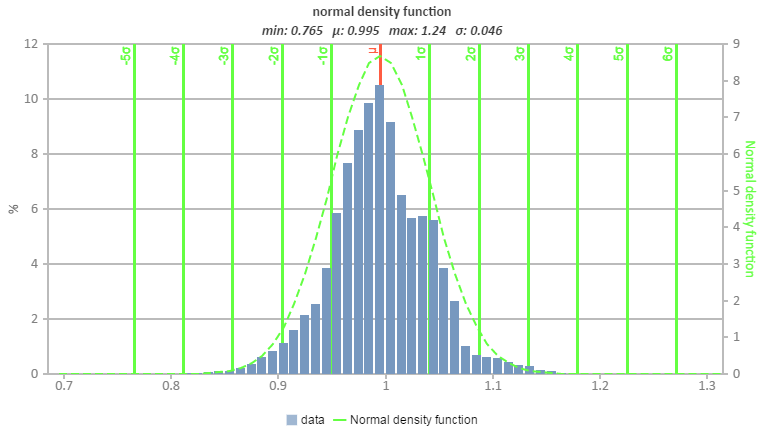
Note that the functions always depend on one specific data series (of the parent or xth child chart).
The following chart functions are available:
|
Name |
Chart Type |
Description |
Key |
|
Lower boundary |
plot |
Adds a lower boundary that connects the smallest neighbor y values for each x value. |
'lb', 'lower boundary' |
|
Upper boundary |
plot |
Adds upper boundary that connects the biggest neighbor y values for each x value. |
'ub', 'upper boundary' |
|
Avg |
plot |
Adds an average line between the min and max values as y = ((maxy - miny) / 2) + miny. |
'avg' |
| Weighted avg |
plot |
Adds a weighted average line between the min and max value according to the number of points as ∑ points(i) * weight(i), where weight(i) = 1 / number of points. |
'avgw', 'weighted avg' |
|
+ / - sigma |
plot |
Adds the sigma values as standard deviations. |
'sigma' |
|
normal density |
histogram |
Adds the normal density function and sigma-grid. |
'ndf', 'normal density function' |
|
Minimum / Average / Maximum |
histogram |
Shows minimum, maximum, and average of one set of data displayed in the chart. |
'minmeanmax', 'min, mean, max' |
|
distribution function |
histogram |
Adds the cumulative distribution function (range 0...1). |
'distribution', distribution function' |
|
Sigma values |
histogram |
Adds the sigma values as standard deviations. |
- |
|
Quartile |
histogram |
Adds the 25%, median, and 75% quartiles. |
'quartile' |
In the generated report, you can add these functions to the chart.
If you use the EATB MATLAB API, you can predefine these functions in the configuration by using tempChart.addChartFunction(''). In this command, one of the keys in the table above can be used in the quotation marks. When you generate the report, the predefined function is displayed.