Calculation Details
Precision
As EATB is based on MATLAB, the result of the calculation is limited to three digits after the decimal point. In very few cases, this limit can become an issue. If you want more precise data in your report, the recommended workaround is to multiply the result or the signal itself by a factor to shift the decimal point to the right. Otherwise, you can use the numberOfDecPosInData parameter. If you increase this number, you get more precise data but larger reports. For more information, see EATB Options.
For time vectors ("interval" and "time" chart types), the smallest unit is microseconds.
|
Note |
|---|
|
The precision of EATB is never higher than your specified interpolation grid or quantity values. |
Interpolation
For the interpolation, the zero-order hold interpolation (in blue color) is used. The linear interpolation (in red color) cannot be used due to the bit signals.
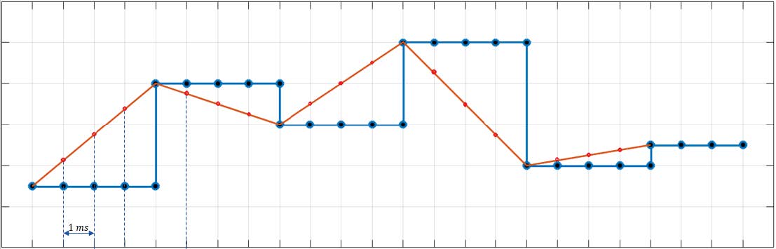
Signals from different channel groups and with different sample rate cannot be compared and used for calculations due to a dimension mismatch. Therefore, you must specify the interpolation grid before starting an evaluation.
Pay attention when choosing the grid value: If the grid is too small, the calculations take much longer. For grids <0.01s, limited memory can become an issue. If the grid is too large, some events are not detected. Take into consideration the time rate of the events you are interested in and adjust the grid appropriately.
Quantity
Quantity is defined as the step size of the quantization applied to the corresponding signal. It affects the amount of data in the report. Considering performance and report size, you should always use the highest possible value for the quantization step size. The smallest value that the quantity can take on is always the sample rate. This means that the quantity can be only a value > 0. A quantity of 0 or negative values are not allowed and lead to an error.
Note that grid and quantity are different: Grid affects the interpolation of each signal in all measurements. Quantity is the step size of the quantizer applied to the signals in a chart.
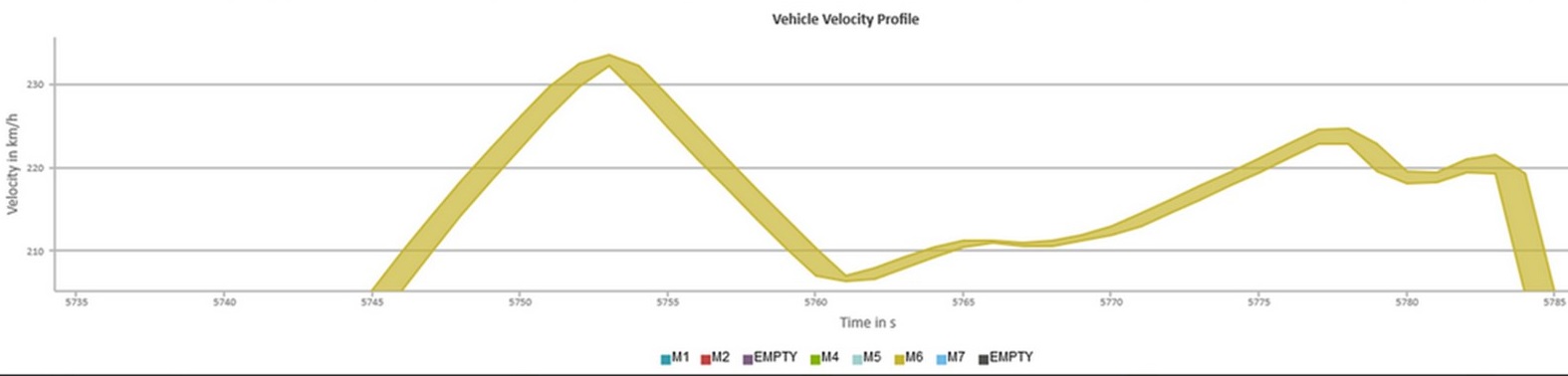
In the following image, a signal over time is depicted and the effect of quantity in timeplots is illustrated. In timeplots, the quantization is applied to the time axis only whereas the values on the y axis are determined differently. Consider the yellow area between the lines. The lines bordering this area represent the minimum and the maximum values over the individual quantization time segments. All points on these time segments that occurred between the minima and maxima are mapped to these two values on the corresponding time segment.
Duplicated Points
All duplicated points in the charts are removed during the calculation to reduce the amount of data. In the report, the tooltip shows the information of the first occurrence of a point.
If several measurement files are used, the point is the first occurrence of all measurement files. Only in case of histograms, you get the first occurrence per measurement file.